Your Amazon main image does two jobs at once: it helps shoppers decide whether to click, and it has to satisfy Amazon's image standards. If it misses either job, the listing can underperform or run into review issues.
The good news is that the core requirements are straightforward. The bad news is that sellers often turn "straightforward" into "almost right," and almost right is where most main-image problems come from.
This guide focuses on the requirements Amazon publicly emphasizes most often, what usually causes image issues, and how to create a clean, compliant hero image without overcomplicating the workflow.
If you plan to use AI anywhere in that workflow, read Can You Use AI Images for Amazon Listings? next. It covers where AI can help and where it can create unnecessary risk.
The Core Rules Amazon Cares About
For the main image, Amazon's public seller guidance consistently points to the same basics:
- Show the actual product being sold.
- Use a pure white background for the main image.
- Make the product fill most of the frame, typically about 85% or more.
- Show the entire product inside the frame.
- Do not add text, logos, badges, borders, or watermarks.
- Do not show props or accessories that are not included with the purchase.
Those rules are the foundation. If you get them right first, the rest of the optimization work becomes much easier.
Size, Resolution, and File Setup
Amazon allows relatively small uploads, but that does not mean small images are a good idea for a live listing.
As a practical baseline:
- Aim for at least 1000 px on the longest side if you want zoom support.
- Use a larger master image when detail matters, especially for textured or premium products.
- Keep the composition simple and square-friendly, because that is how the image is most often displayed in search and on detail pages.
JPEG is usually the safest export for listing images, although Amazon also accepts other formats. In day-to-day workflows, standard RGB or sRGB exports tend to produce the most predictable web color.
For most catalogs, a clean square master in the 1600 to 2000 px range is a good working target: large enough for detail, small enough to manage at scale.
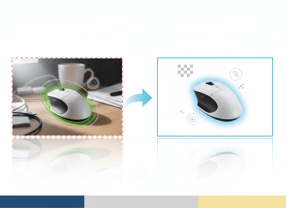
What "Pure White Background" Actually Means
Amazon's public guidance for the main image calls for a pure white background. In practice, sellers usually get into trouble for one of four reasons:
- The background is light gray, cream, or slightly blue instead of white.
- There is a visible gradient from top to bottom.
- The product edge has a halo from sloppy background removal.
- A heavy shadow makes the background read as non-white.
You do not need to obsess over every pixel in isolation, but you do need the finished image to read clearly as a pure white main image to both shoppers and Amazon's review systems.
If you use background-removal tools, zoom into the edges before uploading. Transparent items, reflective surfaces, and fuzzy materials are where bad cutouts show up fastest.
Product Fill: The Most Common Composition Mistake
Many rejected or weak-performing main images are technically sharp but composed poorly.
The usual mistakes are:
- Too much empty white space around the product
- Cropping off a corner or handle
- Showing multiple units when the shopper is buying one
- Showing a bundle visually larger than the actual included contents
The fix is simple: frame the product tightly, but not aggressively. The shopper should be able to understand what is being sold in one glance, and nothing important should be cut off.
What Usually Triggers Problems
Even when sellers know the rules, these are the patterns that repeatedly cause image issues:
1. Over-designed main images
The main image is not the place for badges, discount labels, comparison callouts, or decorative graphics. Save those ideas for ads, storefronts, A+ content, or secondary creative.
2. Props that imply something not included
If a scale prop, lifestyle element, or accessory helps explain the product, move it to a secondary image. The main image should stay literal and uncluttered.
3. Variant mismatch
If the shopper is buying the black version, the main image must clearly show the black version. This matters especially for apparel, beauty, home goods, and electronics with multiple finishes.
4. Image does not match the title or selection
Amazon's image guidance is not just about cleanliness. The image also has to accurately represent the product being sold. If the title, selected variation, and hero image do not line up, trust drops immediately.
5. Trying to do too much with one image
The main image should not explain everything. It should make the product clear. Use secondary images for detail shots, in-use scenes, size context, and feature explanations.
Category-Specific Rules Still Matter
The general rules above are only the starting point. Some Amazon categories and product types have their own style guides or additional image expectations.
That means you should not assume one setup works for every catalog. Apparel, beauty, jewelry, footwear, and hardlines categories can each have different expectations around framing, model use, packaging, or supporting image types.
The safest workflow is:
- Follow the global main-image rules first.
- Check whether your category has its own style guide.
- Build a category-specific checklist before you batch-produce images.
If you skip step two, you can end up with a perfectly clean image that still is not ideal for the category you sell in.
A Practical Workflow for Compliant Main Images
If you want a reliable process, use this sequence:
- Start from a real product reference, whether photographed traditionally or captured for an AI-assisted workflow.
- Build one clean square master image per SKU or variant.
- Check the background, edges, crop, and product fill at 100% zoom.
- Confirm the product shown matches the selected variation exactly.
- Use a plain, literal main image first; move storytelling to secondary images.
This is also the safest way to use AI in an Amazon workflow: use AI to clean, standardize, or extend good source imagery, not to invent a product presentation that drifts away from the real item.
Final Checklist Before You Upload
- Main image shows the actual product being sold
- Background reads as pure white
- Product fills most of the frame
- Entire product is visible
- No text, watermarks, badges, or borders
- No props or extras that are not included
- Variant, title, and image match each other
- Image is large enough to look sharp and support zoom
Related Reads
- Can You Use AI Images for Amazon Listings?
- Marketplace Product Image Checklist for Amazon, Shopify, Etsy, and eBay
- Amazon Product Image Generator
Bottom Line
Amazon main image compliance is not about tricks. It is about clarity, accuracy, and restraint.
If your main image is clean, literal, high-resolution, and obviously centered on the product being sold, you are already doing the hard part right. The problems usually start when sellers try to make the hero image behave like an ad.
If you want to create Amazon-ready hero images faster, use a workflow built for marketplace constraints from the start. Sellshot helps teams generate and standardize clean listing images without turning the main image into generic AI art: Start free trial ->